Widely used Bootstrap feature with improvements to allow collapse, minimize and closing
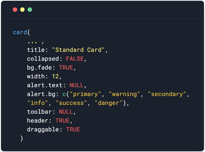
card(
  ...,
  title = "Standard Card",
  collapsed = FALSE,
  bg.fade = TRUE,
  width = 12,
  alert.text = NULL,
  alert.bg = c("primary", "warning", "secondary", "info", "success", "danger"),
  toolbar = NULL,
  header = TRUE,
  draggable = TRUE,
  id = NULL
)
Arguments
- ...
The elements to include within the body of the card
- title
The text to display in the header title
- collapsed
If
TRUE, the card is collapsed. The default isFALSE- bg.fade
If
TRUE, the background will be faded if a background exists- width
Select a width from 1 to 12 to indicate the size of the card
- alert.text
Enter text for the alert portion. Leave as NULL to exclude the alert
- alert.bg
Indicate the type of alert to include, choices are "primary", "warning", "secondary", "info", "success", "danger"
- toolbar
The default is NULL, which means all toolbar will be displayed use this to set what toolbar to show.
- header
If
FALSE, the header will be excluded- draggable
If
FALSE, the card will not be draggable- id
unique card id
Value
HTML code of the container with a class called card that holds the items
Note
For more information on the features of the card, visit the examples section of the help documentation
Examples
if(FALSE){

# Example 1
if (interactive()) {
  library(shiny)
  library(nextGenShinyApps)

  shiny::shinyApp(
    ui = fluidPage(
      style = "4",
      custom.bg.color = "lightblue",
      sidebar = NULL,
      header = titlePanel(left="Card Ex2"),
      wrapper(
        altPanel(
                 card(
                   title = "Standard card",
                   collapsed = TRUE,
                   alert.text = "An alert2 for the content",
                   alert.bg = "warning",
                   toolbar = list(collapse = TRUE,
                                  maximize = TRUE,
                                  close = FALSE,
                                  menu = TRUE),
                   shiny::h3("Sample text"),
                   "Lorem ipsum dolor sit a"
                 )),
        mainPanel(
          card(
            title = "Standard card 2",
            shiny::h1("Sample text"),
            "Lorem ipsum dolor sit a"
          ))
      )
    ),
    server = function(input, output) {
    }
  )
}

# Example 2
if (interactive()) {
  library(shiny)
  library(nextGenShinyApps)

  shiny::shinyApp(
    ui = fluidPage(
      style = "8",
      custom.bg.color = "#d9d9d9",
      sidebar = NULL,
      header = titlePanel(left="Card Ex1"),
      wrapper(
        altPanel(width = 12,
                 card(
                   title = "Standard card",
                   alert.text = "An alert1 for the content",
                   shiny::h3("Sample text"),
                   "Lorem ipsum dolor sit a"
                 ),
                 card(
                   title = "Standard card",
                   collapsed = TRUE,
                   alert.text = "An alert2 for the content",
                   alert.bg = "warning",
                   toolbar = list(collapse = TRUE,
                                  maximize = TRUE,
                                  close = FALSE,
                                  menu = TRUE),
                   shiny::h3("Sample text"),
                   "Lorem ipsum dolor sit a"
                 ))
      )
    ),
    server = function(input, output) {
    }
  )
}


}